Detail is basically a brand new (and much better) app
User interface: A unified design aesthetic
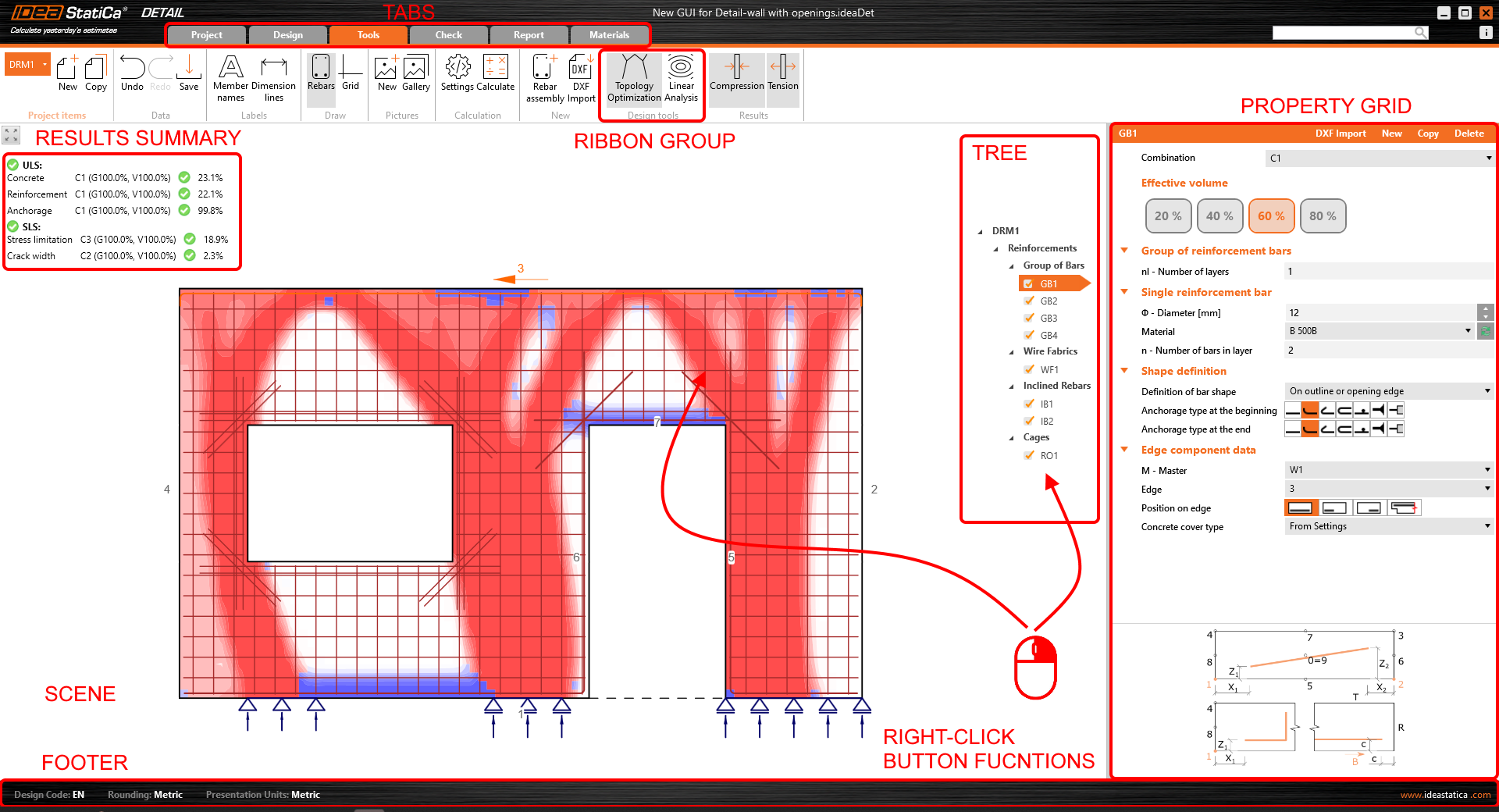
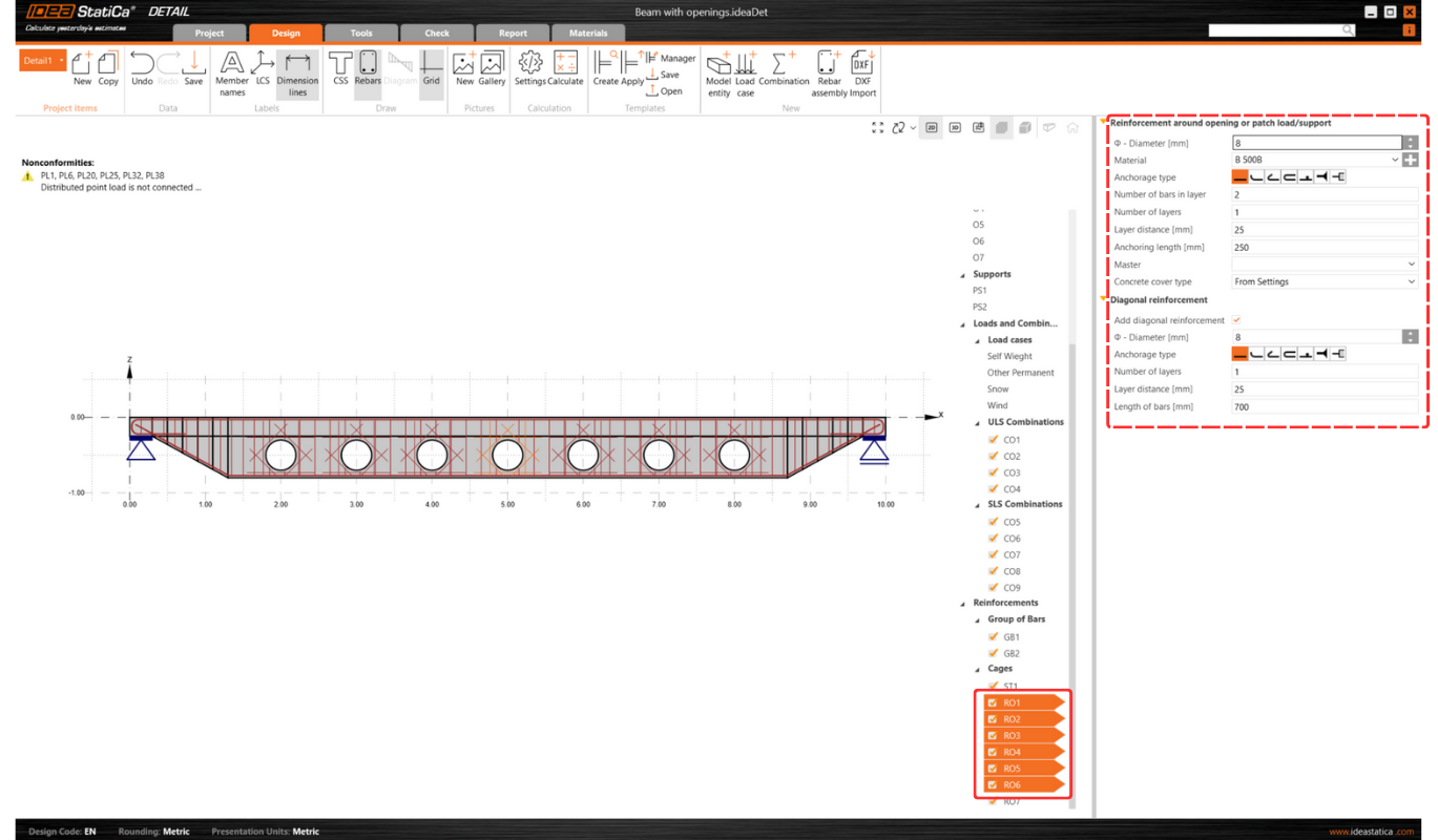
Ever experienced a slightly jarring switch between the different apps in our platform? You can say goodbye to that! In our latest version, we’ve aligned the UI of IDEA StatiCa Detail with its steel-structured older sibling, the Connection application. This change isn't just cosmetic, it's about creating a seamless, intuitive interface that feels familiar across our platforms. Introduced in version 23.1 and perfected in 24.0, navigating between applications is now a breeze, enhancing both your efficiency and comfort.
Shared preferences across apps
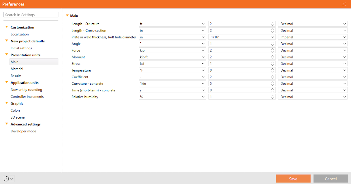
Consistency is key, which is why any change you make in the preferences of one application now ripples across to all others in our app suite. This unified philosophy ensures a smoother, more predictable design process, and you no longer have to waste time adjusting settings in each application separately. It should always be about making life easier, right?
Spring clean-up: Code and architecture optimization
We’re all about laying strong foundations here—not just in the structures you design, but in our software too. The architectural overhaul of IDEA StatiCa Detail’s code was ready for a serious spring clean—out with any old bugs and in with streamlined, sturdy coding practices. This significant clean-up means fewer headaches and disruptions when implementing new features. Our developers have dedicated many precious hours to making the code more robust and went back to the roots to prepare it for all and any big improvements in the future. Crucially, the clean-up has significantly sped up the application, freeing up valuable time for you to do whatever you like to do instead!
Property Grid overhaul: Everything in its right place
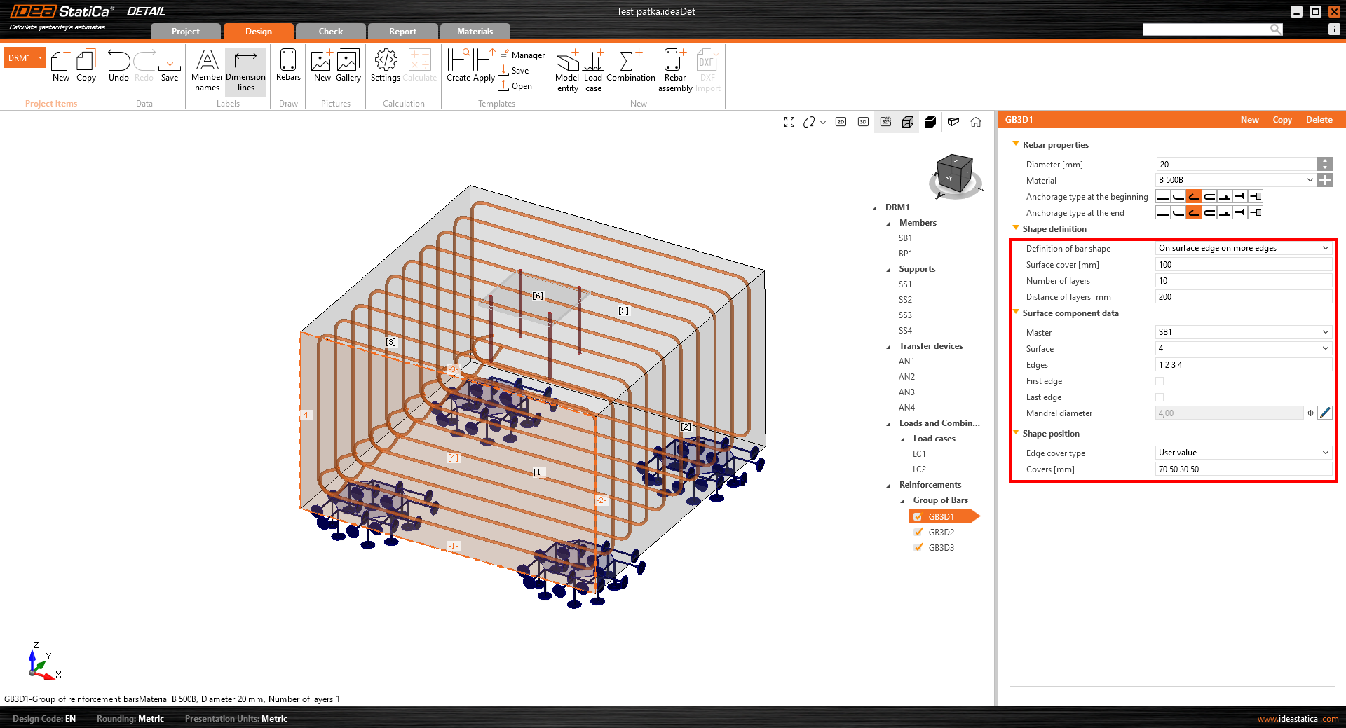
Remember the old Property Grid? It lacked consistency and could cause the occasional confusion. Well, it's had a major facelift. The new grid is organized logically, making it far easier to find what you need quickly. This change isn’t just for aesthetics—it’s about functionality, streamlining your workflow and reducing the time you spend on adjustments. On top of that, it was necessary in order to implement the following feature...
Multi-select/edit: A game changer in UX
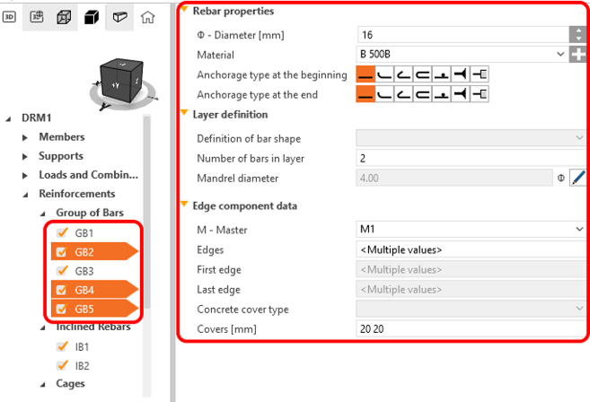
Prepare to be wowed—IDEA StatiCa Detail has not only matched the UI of its steel-structured sibling, the Connection application, but it has also enhanced the UX with the highly anticipated multi-select and edit feature. This feature is a game-changer, especially for reinforcement editing. Imagine the ease of bulk editing properties like diameter, anchorage type, or layer definitions, all in one go. Importing and editing multiple entities from DXF files has never been simpler. We can hear the collective sigh of relief from here!
Report Tab: Customizable and user-friendly
Another significant enhancement comes to our report tab, which has been updated for greater customization. Now, you can reorder sections via drag and drop, toggle them on or off, and even add personalized user paragraphs for introductions that make your reports truly yours. The Bill of Materials (BOM) has also been enriched with more detailed functionality, aiding in easier identification and exporting options for reinforcements.
Unified materials tab: Streamlined and efficient
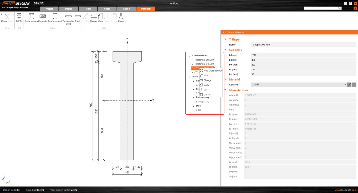
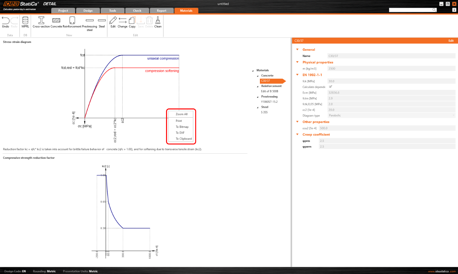
In our continuous pursuit of simplicity and efficiency, the materials tab in IDEA StatiCa Detail has been completely reworked. Positioned conveniently on the right side of the scene, you now find cross-sections and materials neatly organized into a tree of entities. This alignment mirrors the organization found in other tabs, ensuring a consistent and intuitive navigation experience across the application. Managing cross-sections and materials has never been easier, thanks to a dedicated property grid that displays all essential information at a glance.
Don't miss out on exploring individual cross-sections in the scene and examining stress-strain diagrams of various materials. And yes, exporting data into various formats is just a click away, making your design process as flexible as it is efficient.
The 3D Detail: Cutting-edge technology in Beta
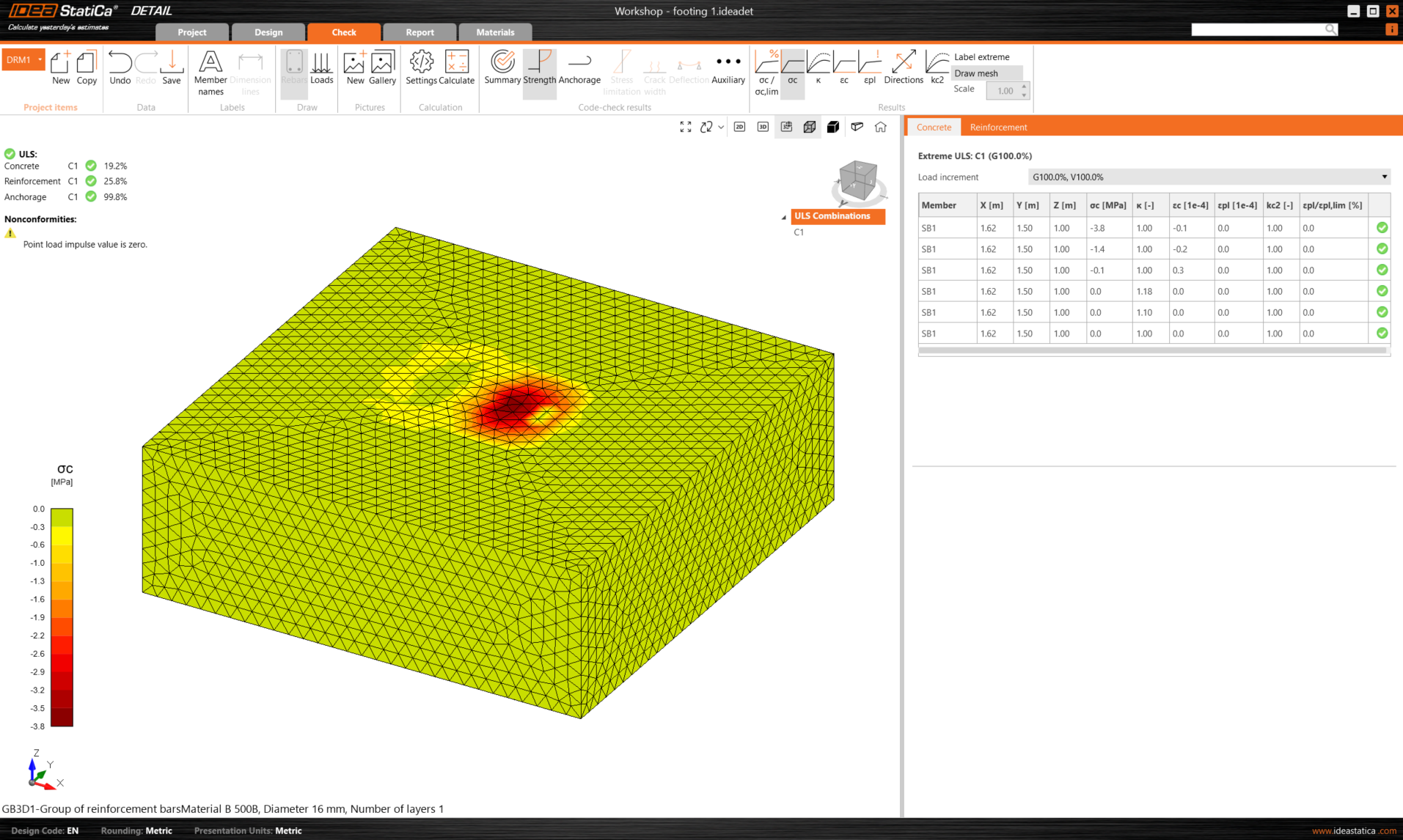
And there’s more—introducing the revolutionary 3D Detail (Beta), a solution that is set to revolutionize the game for 3D structural tasks. Whether you’re working on anchoring in concrete blocks or dealing with walls subjected to general loads, 3D Detail (Beta) allows you to tackle these complex problems without the need for oversimplification. This beta version utilizes a method adapted from the Compatible Stress Field Method, now tailored for tri-axial stress conditions, extending our software’s capabilities into the third dimension. While still in beta, this tool offers a glimpse into the future of structural design, allowing you to experiment with advanced techniques in a controlled setting. Explore this pioneering feature and contribute to its refinement by sharing your feedback and experiences.
Get a taste of the future
We are giving you early access to this Beta version to try out for yourself while we continue putting it through its paces in our rigorous verification process. This is accessible to current users with the latest version and valid maintenance. If you fulfill the prerequisites, you can request free access by clicking the Beta Detail icon in the Connection app ribbon, which will take you to this landing page, where you complete the form and request to join the Beta program and get free access to 3D Detail.
*Please be aware that the beta for the ACI code is currently unavailable.


